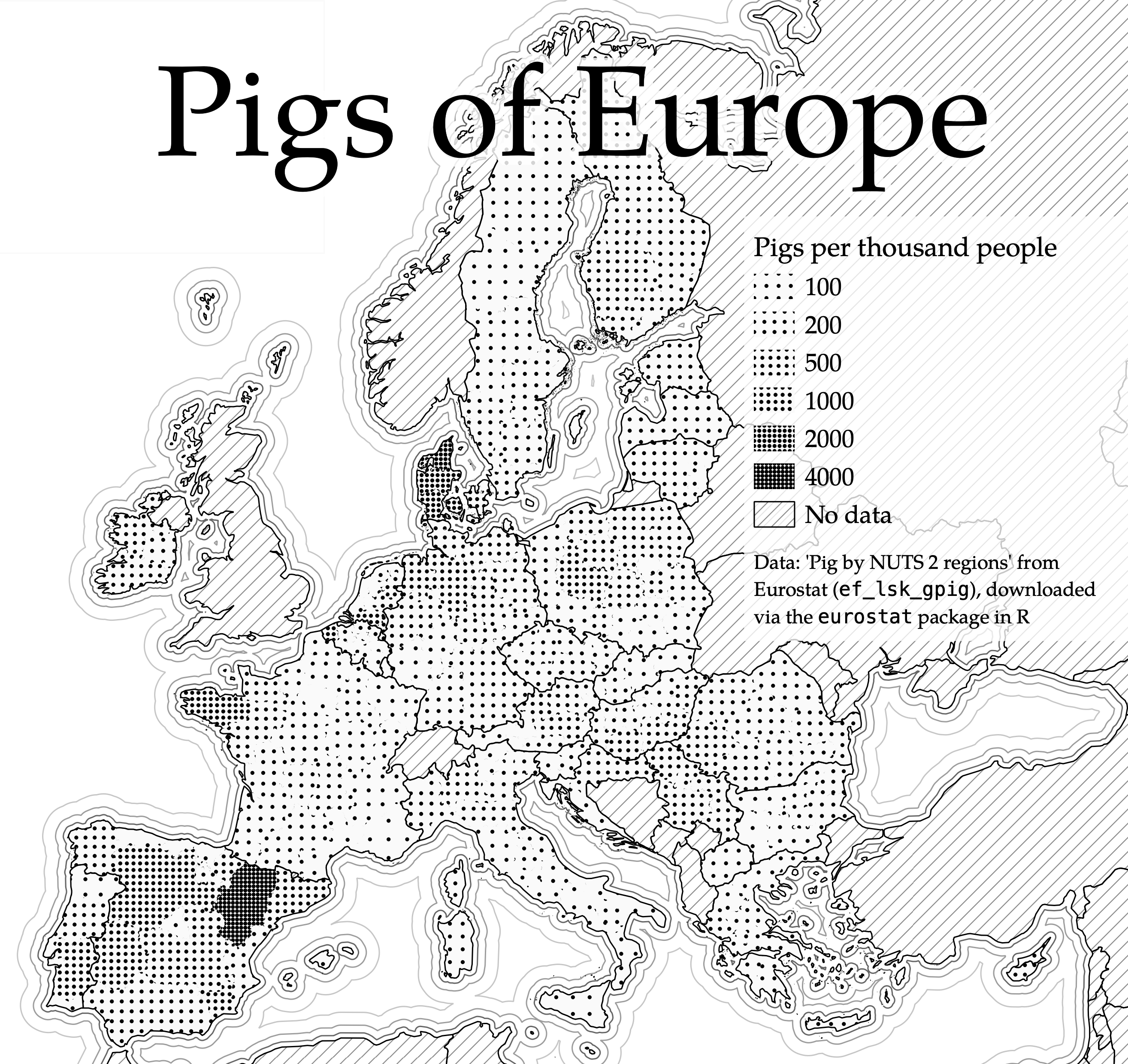
For the ‘monochrome’ day of the #30DayMapChallenge I made a fairly simple univariate map: the number of pigs per thousand people, visualised with points: denser points = more pigs per capita. I got the data from Eurostat (one of the mythical Brexit dividends is that since leaving the UE (and Eurostat) the UK is excluded from these kinds of map) via the eurostat R package.
To link the point density to the pigs per person, I used the Expression String Builder in QGIS – I played around with this for a bit to get a satisfactory spread of density

One of the surprises of the Challenge was that this map highlighted the Spanish region of Aragon as the pig capital of Europe – I didn’t give this fact much thought when making the map but it subsequently found its way to Aragonese Twitter, and so for a few days my replies were filled with Spanish comments on the map.
#30DayMapChallenge Day 9: Monochrome
🐖 Pigs of Europe 🇪🇺 pic.twitter.com/8E27dljpyk— Matthew Law (@Iawmatthew) November 9, 2021